- EAN13
- 9783721203417
- Éditeur
- NIGGLI
- Date de publication
- 17 mars 2011
- Collection
- NIGGLI EDITIONS
- Nombre de pages
- 304
- Dimensions
- 28,5 x 23,5 x 2,7 cm
- Poids
- 1712 g
- Langue
- mul
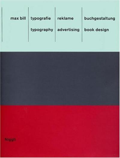
Typography. Advertising. Book Design - Typografie. Reklame. Buchgestaltung, Allemand/Anglais
Max Bill
NIGGLI
Prix public : 49,00 €
<p>The book at hand offers a comprehensive view into an area of work from Max Bill that has so far received little attention: typography, advertising and book design. One discovers Max Bill as the tireless creator of highly individual types and commercial logos as well as a designer with a sense of visual humor - not exactly a common aspect of constructive design in this country.Bill pursued two opposing principles and accordingly left behind two lines in his work: a graphic one and a sculptural one. Taking Herbert Bayer's universal type as a point of departure, Bill developed two lettering schemes for the Neubühl housing development and the firm "wohnbedarf", which departed from all then-known forms. The reason for the stretched "o" in "wohnbedarf" may well have been grounded on how one perceives the text from the side; yet, behind this understanding lie formal ideas and the reductionist concept of the Bauhaus.</p>
